Mobile Collection Creation
Redesigning CloudSpot’s core mobile workflow around first-time activation
Role
Lead Product Designer
Company
CloudSpot
Year
2026
Ownership: Led the end-to-end redesign of mobile Collection creation, from funnel analysis and first-hand teardown through the simplified first-time experience and full returning-user flow.
Team: Partnered with Product, Growth, QA/Support, and engineering. Initial issues and competitor analysis came from Product and Growth; I conducted the detailed flow teardown and owned the UX direction and product decisions.
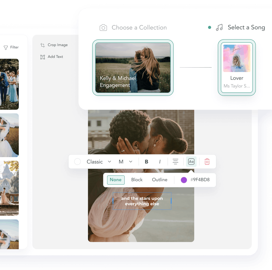
Goal: Reduce friction in the first mobile session and help more new photographers reach their first created Gallery, without limiting the full mobile workflow they would need as they continued using CloudSpot. The redesign covers Collection creation through the moment a user creates a Gallery.
Mobile users were dropping before they experienced CloudSpot’s core value.
About 40% of new users start on mobile, and a third begin creating a Collection there. But the experience performed substantially worse than desktop: 62.5% reached Gallery creation on mobile compared with 83.6% on desktop.
The biggest drop happened almost immediately. 70% of mobile users who started a Collection never uploaded their first photo, meaning most never reached the part of the product CloudSpot is built around: turning their work into a Gallery they can deliver to clients.
That made this more than a mobile usability cleanup. Internal cohort research showed that publishing a Gallery more than triples the upgrade rate, making the Collection-to-Gallery flow an important activation point for both users and the business.
.jpg)
.jpg)
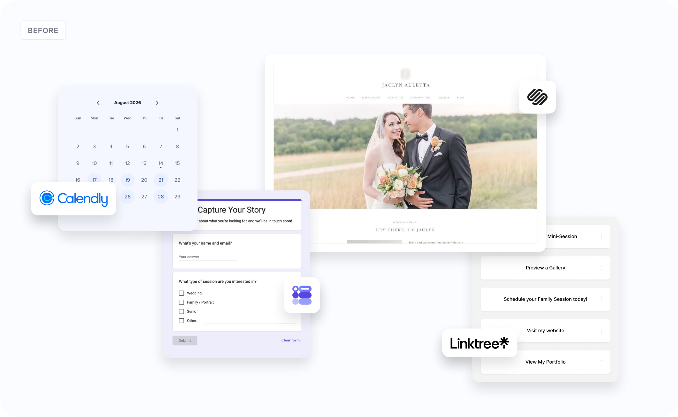
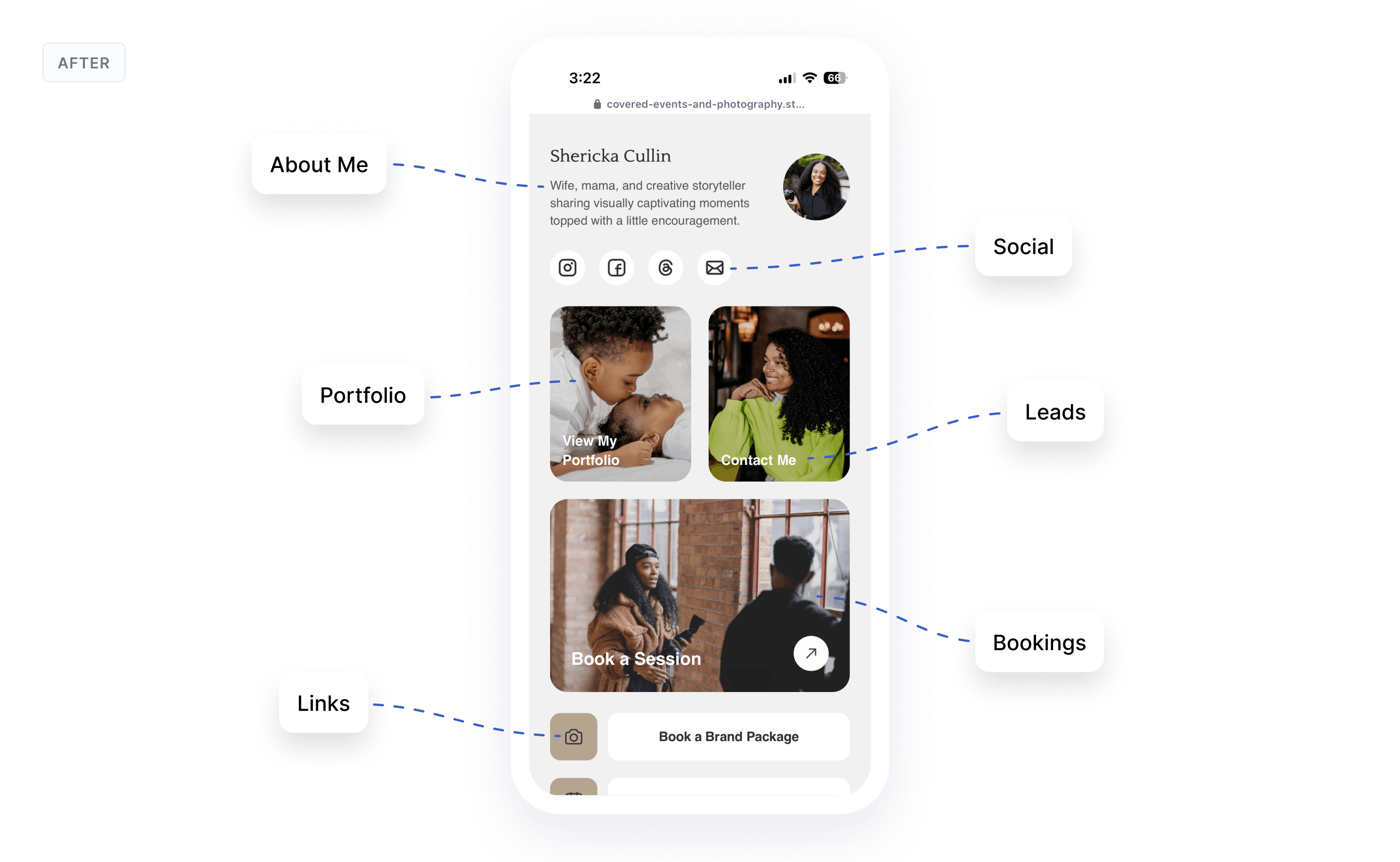
Photographers needed something faster than a website, but more credible than a link list.
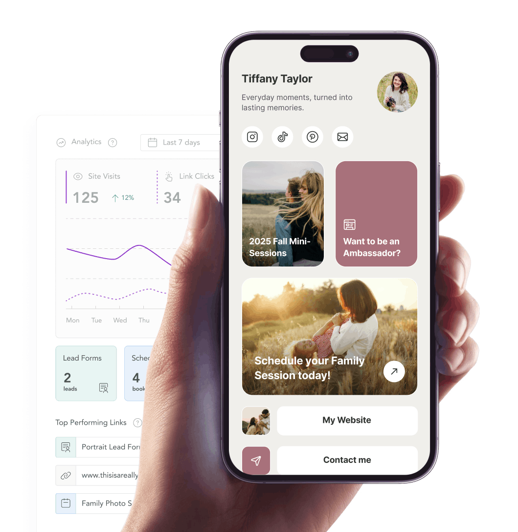
The core user was a professional photographer, often a solo operator, who relied on Instagram as a primary marketing channel and needed one trusted link to share publicly.
A generic list of buttons could route traffic, but it couldn’t build trust. Potential clients needed enough context to understand who the photographer was, what they offered, what it might cost, and why they should take the next step.
At the same time, the product had to stay low-maintenance. Most photographers were not going to fine-tune layouts or update blocks every week. They needed something they could set up quickly and trust to represent them well over time.
That created the core design tension: Social Site had to be optimized for a short setup window, but its value would be measured over months of passive use. A photographer might spend 15 minutes creating the page, then expect it to live in their Instagram bio as a professional front door for their business.
That meant opinionated defaults mattered more than customization depth. The product needed to create a strong first result quickly, not promise one after hours of configuration.
The biggest decisions were about what Social Site should not become.
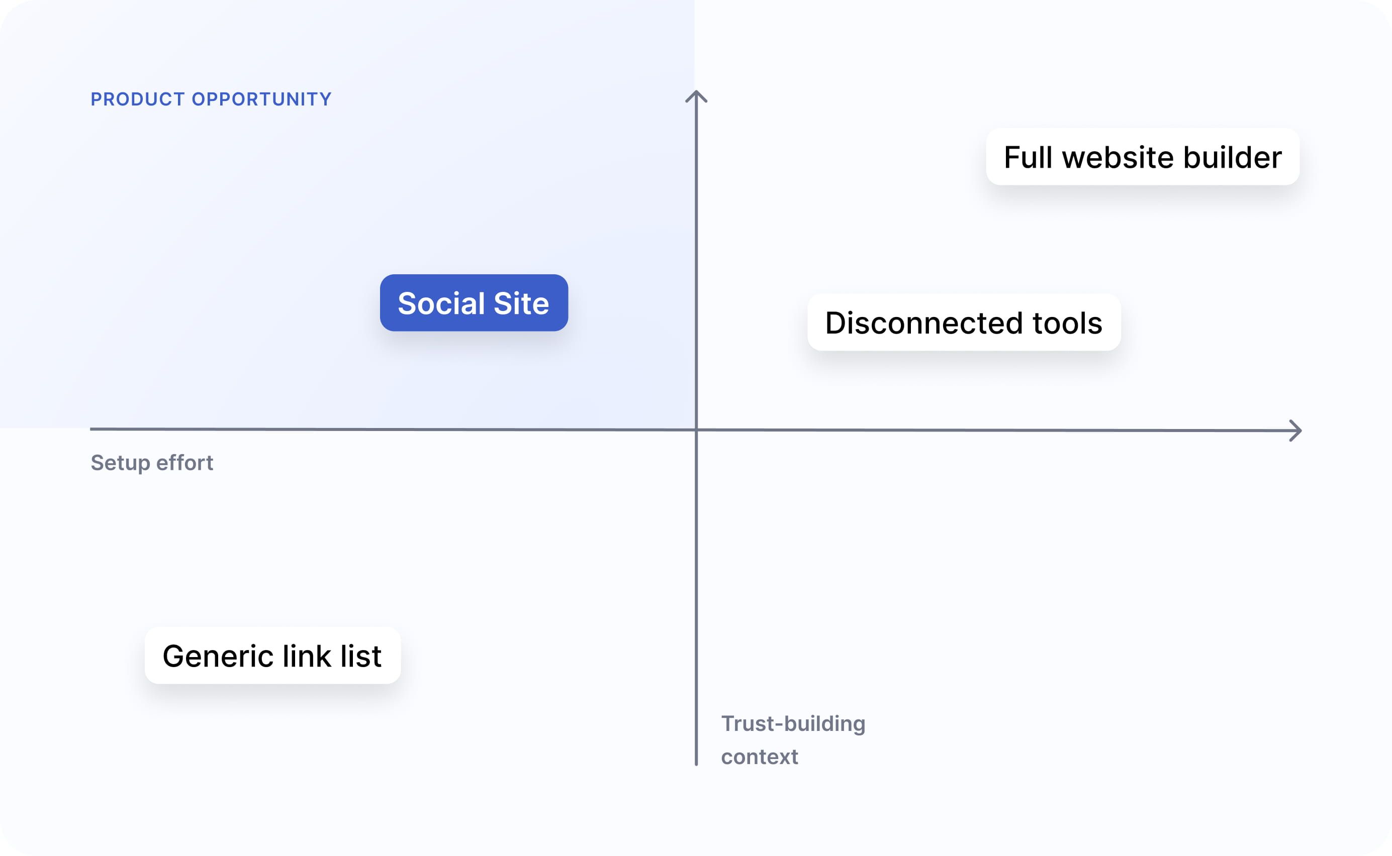
Social Site had to feel more useful than a generic link page, but simpler than a website builder. That meant every major decision came back to the same question: how much structure would help photographers create something credible without turning setup into another project?
The natural gravity of a “build your own page” feature pulls toward more: navigation, custom layouts, advanced styling, custom domains, and CMS-like content. Each addition would have been individually reasonable. Together, they would have turned Social Site into a website builder.
I held the product to a single-page, stacked structure with a small set of meaningful customization controls. No page-level navigation. No freeform layout. No CMS features. The product needed to make one page well, not many pages adequately.
Why it mattered: A clear scope boundary made speed, simplicity, and mobile quality possible. Without it, every feature conversation would have pulled Social Site toward a product category it was not meant to compete in.
%20(1).jpg)
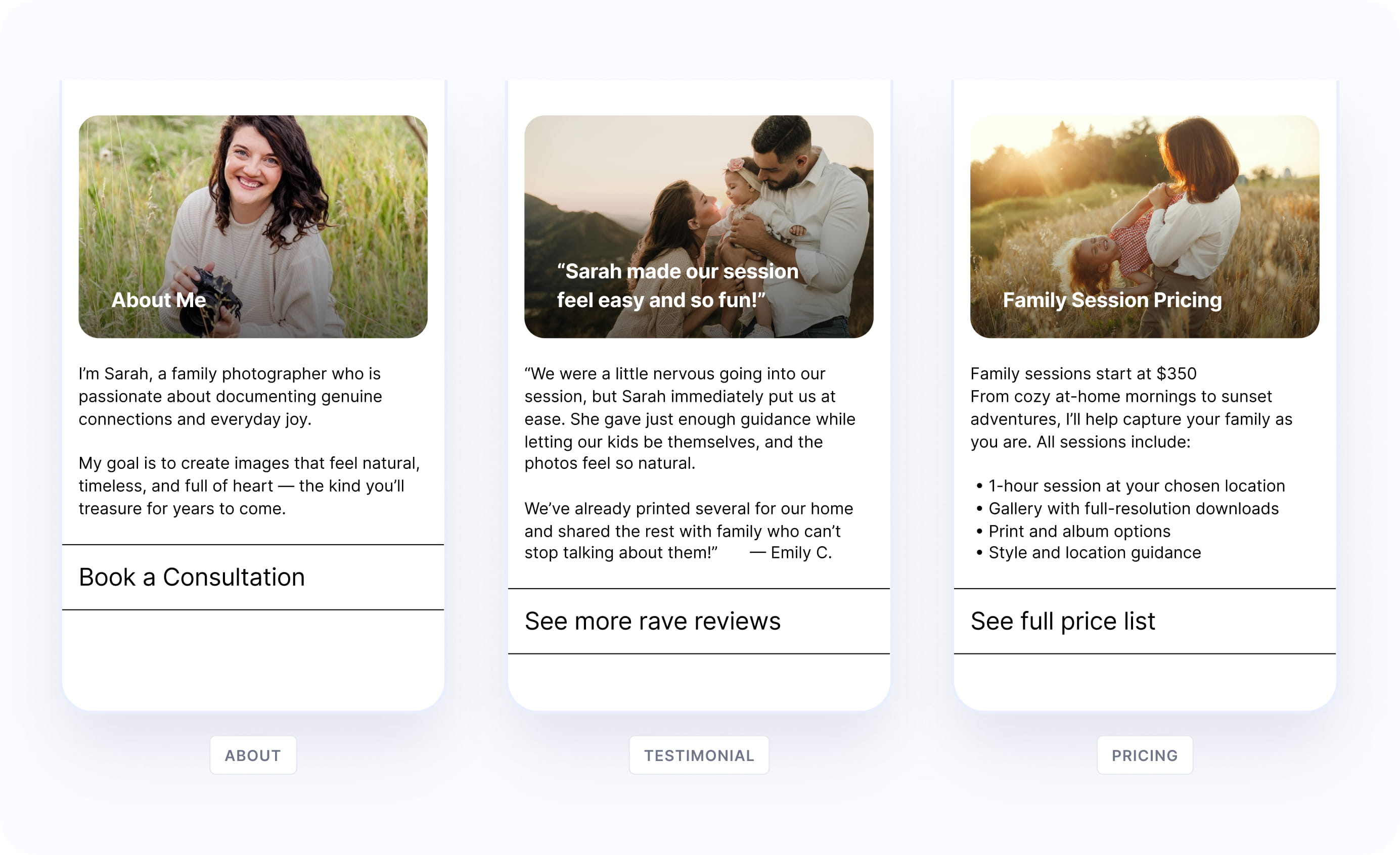
A generic link list could route visitors, but it could not give potential clients enough context to trust the photographer. They needed space for things like an introduction, pricing guidance, testimonials, featured work, or a stronger call to action.
The obvious solution would have been a library of purpose-built blocks: About, Pricing, Testimonials, Galleries, FAQs, and more. But that would have expanded the product toward a lightweight website builder and increased both design and engineering complexity.
Instead, I designed one reusable content block with a fixed structure: image, headline, body copy, and CTA. Users could adapt it to different needs, but they could not redesign the layout. The styling was inherited from the selected Social Site template, so the content block always felt visually consistent with the link list and overall page.
Why it mattered: This gave photographers a way to build trust beyond a list of links, while keeping the product intentionally constrained. The block was flexible enough to support multiple content needs, but structured enough to protect setup speed, visual consistency, and MVP scope.
.jpg)
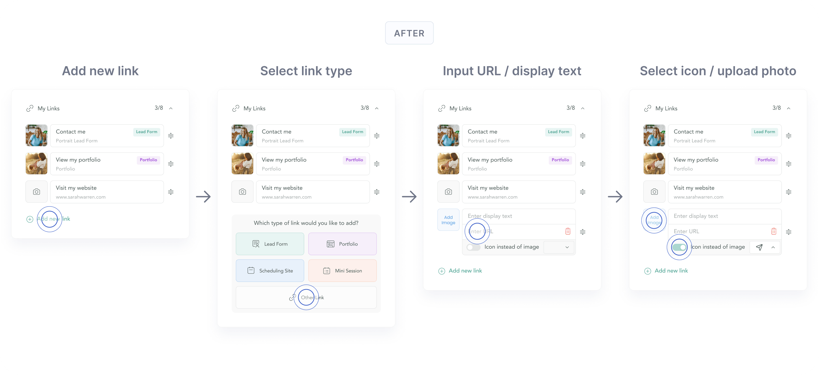
During early interviews, the link editor created an unexpected stopping point. Users added one link, looked for an “add another” action, and stalled. The page technically allowed them to continue, but the next step and its surrounding context was not obvious enough.
Rather than waiting until the full research round was complete, I made a targeted change overnight before the next batch of interviews. The update clarified how users added links — as well their interactions with link types, uploading images, selecting icons, and better visibility into display text vs. URLs. The next morning’s participants moved through the flow successfully..
Why it mattered: The link list was the foundation of every Social Site. Fixing this interaction removed friction from the product’s most essential creation flow.
.png)
.jpg)
.png)
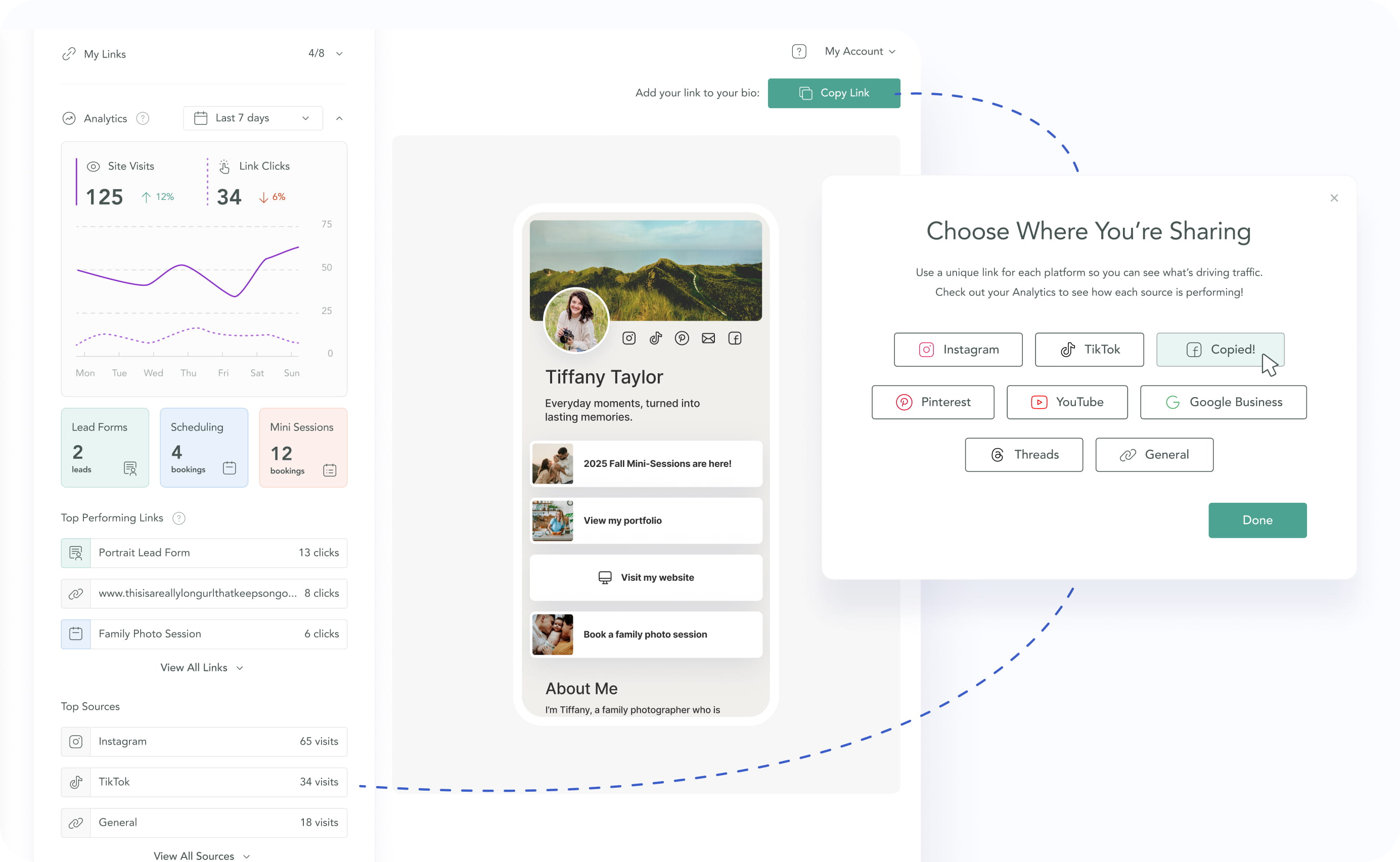
A single copy-URL button would have been simpler to build, but it would have made source attribution impossible. I shifted the sharing model toward platform-specific links for Instagram, TikTok, Facebook, Pinterest, and a general fallback.
Choosing a destination before copying the link made sharing feel more intentional and created the data foundation for the analytics panel.
Why it mattered: Attribution could not be bolted on later. The sharing experience and analytics model had to be designed together
.jpg)
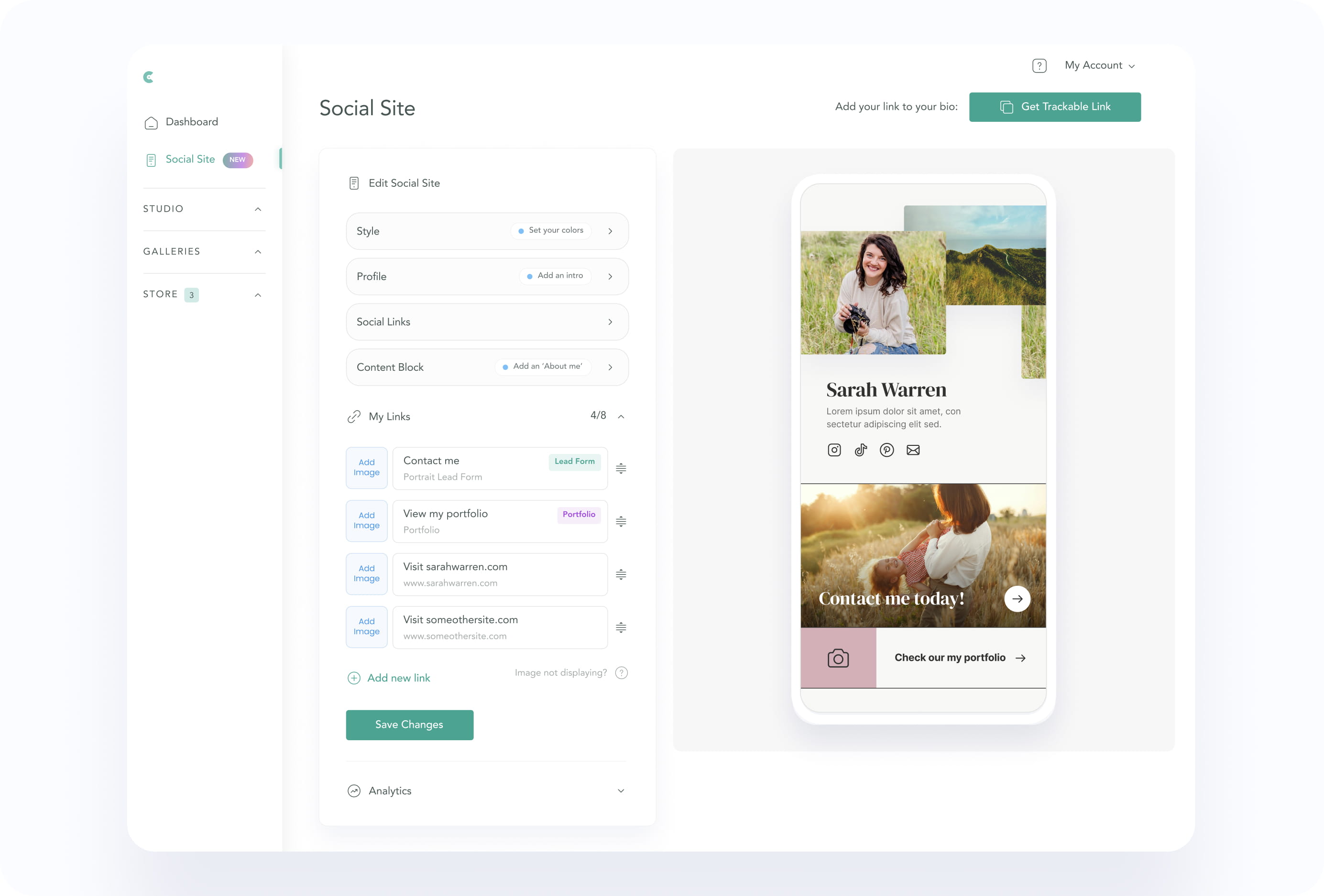
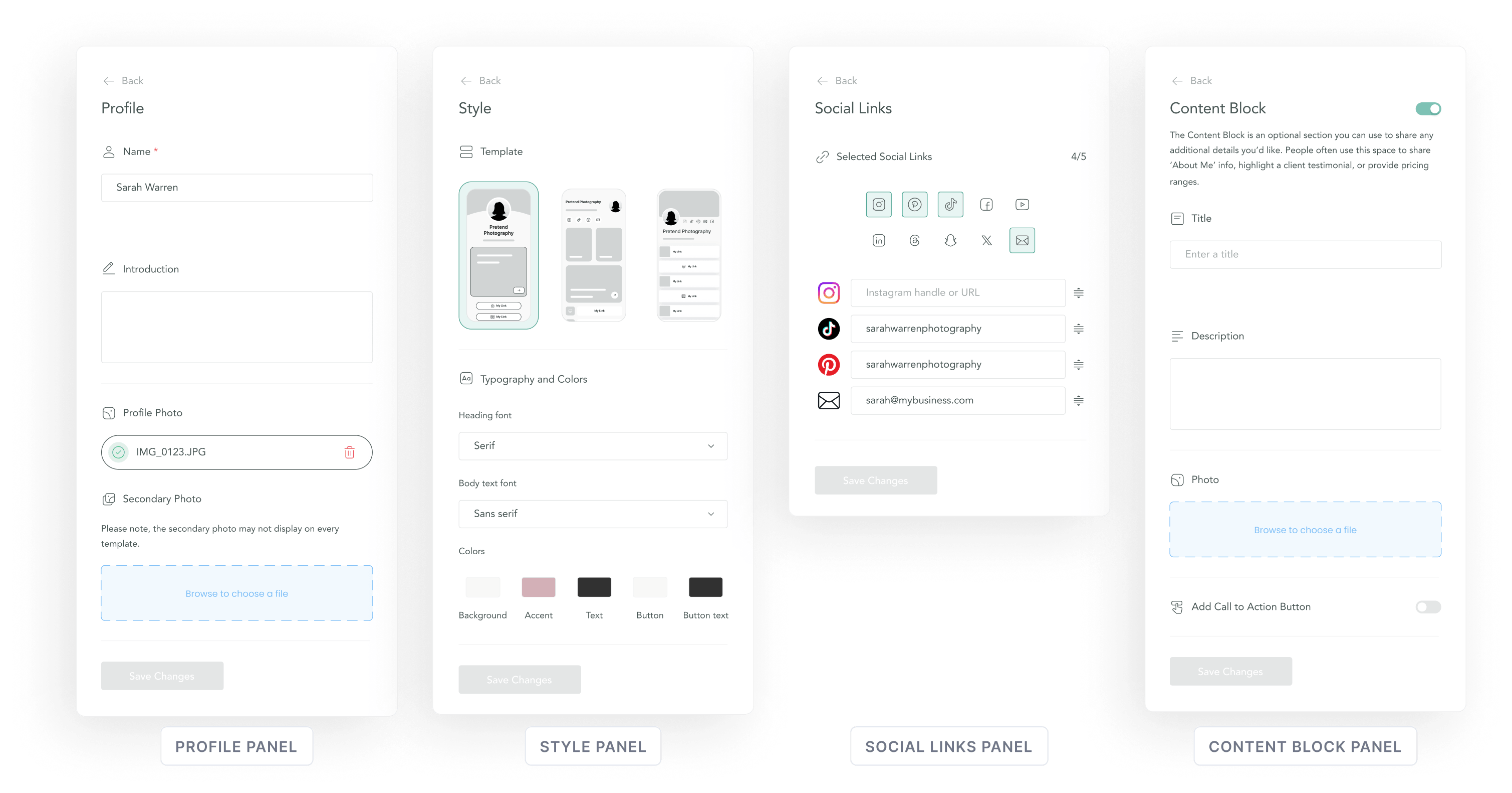
The launch version covered the full funnel, from setup to attribution.
Social Site launched as a complete product surface across the public page, setup flow, editor, sharing experience, and analytics.
The release included:
The goal was not feature breadth. It was to establish a credible marketing surface, learn whether photographers would use it as their live bio link, and instrument the funnel before deeper optimization.
.png)
.png)
.png)
.png)
Social Site is converting visitors into action at a rate far above typical link-in-bio pages.
Social Site launched publicly on May 20, 2026. Within roughly 60 days, Social Sites reached a 49.7% visitor-to-click rate, meaning nearly half of visitors clicked through to a photographer’s linked destination.
That result matters because the product was never designed to match generic link-in-bio tools feature-for-feature. It was designed to create a more intentional conversion surface: one that gives visitors enough context to trust the photographer and clear paths into CloudSpot-native actions like galleries, lead forms, scheduling, and booking.
Compared with common link-in-bio benchmarks, the early conversion signal was unusually strong.
The result supports the core product bet: photographers did not need a longer list of links. They needed a more intentional page that added context, directed visitors into CloudSpot-native actions, and made the next step obvious.
%20(1).jpg)
.jpg)
The hardest part was keeping the product focused as every reasonable request pointed toward more.
More customization, more content flexibility, deeper analytics, and stronger branding controls all had valid arguments behind them. But together, they would have pushed Social Site toward a slower, heavier product.
The most important design work was defining where the product stopped. Social Site needed enough structure to help photographers build trust, but not so much flexibility that it became a website builder. The launch results reinforced that bet: a focused, opinionated page could convert visitors into action at a rate far above typical link-in-bio tools.