CloudSpot Design System
Turning repeated UI decisions into reusable product foundations
Role
Lead Product Designer
Company
CloudSpot
Year
Late 2025-2026
Ownership: Led the design system strategy and Figma implementation, from auditing legacy patterns and establishing shared foundations to defining components, states, accessibility requirements, and usage rules.
Team: Partnered primarily with one senior fullstack engineer, with additional engineering support over time, to align Figma components with reusable Storybook and production components.
Goal: Create a shared product foundation that made common UI patterns more consistent, reusable, accessible, and easier to implement.
The same UI problems were being solved repeatedly.
When I joined CloudSpot, common patterns like dialogs, buttons, inputs, typography, spacing, and icons varied across the product. Years of feature development had left multiple generations of UI living side by side, often solving the same interaction problems in different ways.
As I worked with engineering, I saw the same issue in development. Similar components were being rebuilt from project to project instead of reused from a shared foundation. That created unnecessary design decisions, implementation work, and ambiguity during handoff.
I proposed making the design system a focused priority, starting with patterns that appeared most often, varied most across the product, or created the most friction for design and engineering.
.webp)
.jpg)
.jpg)
Start with the patterns creating the most friction.
Rather than rebuild the entire system at once, I audited how common patterns were being used across CloudSpot, looking for repeated solutions, meaningful variations, accessibility gaps, and places where inconsistency created unnecessary work.
I worked primarily with a Senior Fullstack Engineer in a recurring design-system review, usually tackling one area at a time. I would audit the existing product, define the component structure and states in Figma, then review it with engineering before it was implemented in Storybook and code. Real implementation needs often changed the design, from adding a second text-field label pattern to aligning icon and typography naming more closely with code.
That created an iterative workflow:

At the same time, I was refining CloudSpot’s broader brand, which let me pressure-test shared foundations like color and typography across both product and marketing.
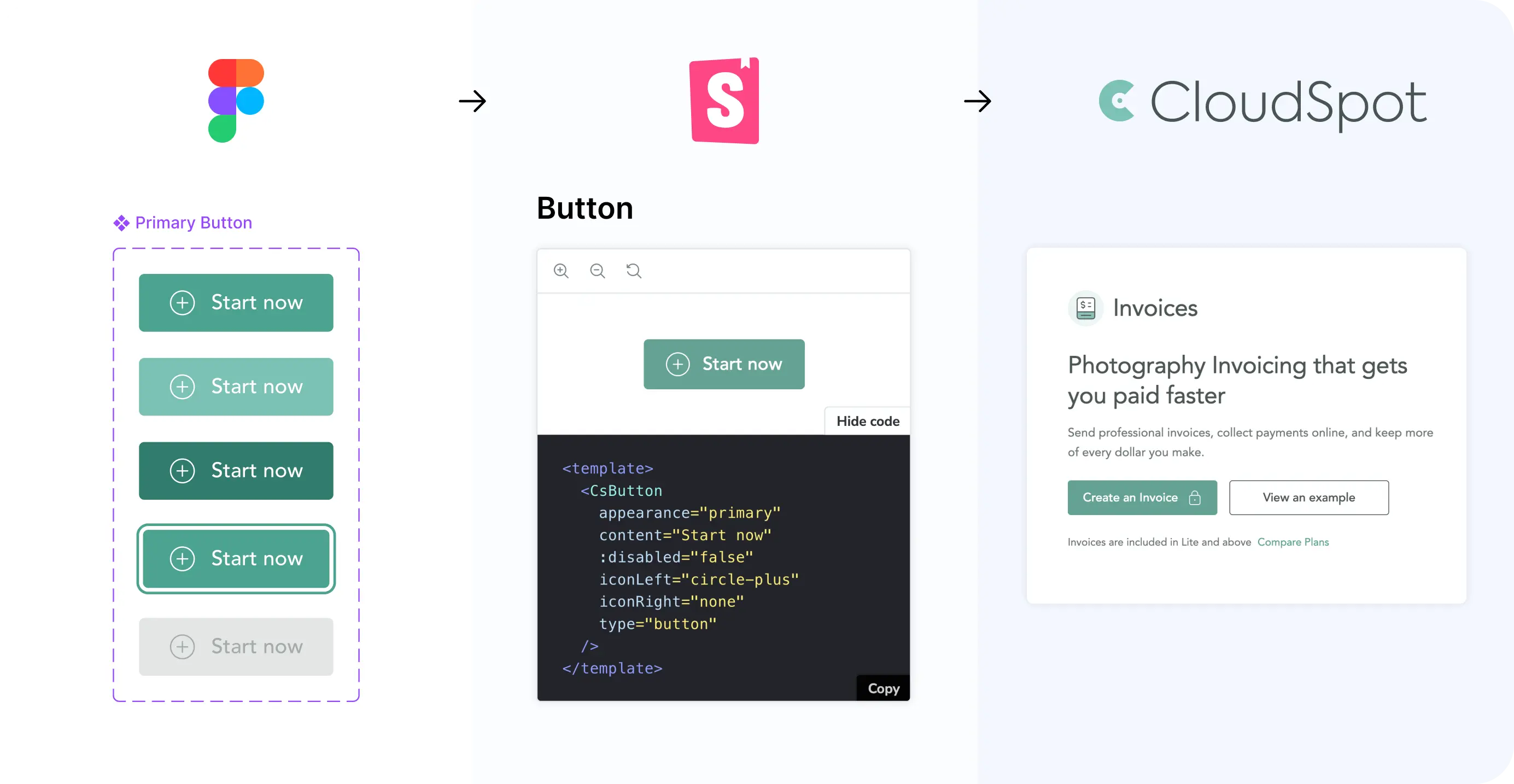
%20(1).jpg)
The biggest decisions were about making the system useful in real product work, not just complete in Figma.
A design system would only create leverage if it reflected the product CloudSpot actually had, mapped clearly to how engineering built it, and defined enough behavior to reduce repeated interpretation. That meant making deliberate choices about what to standardize, where variation was justified, and how design and code would stay aligned as the system evolved.
I didn't want to create a clean component library that only worked in theory. I started by auditing patterns already in use, then used those real product needs to determine what each shared component actually had to support.
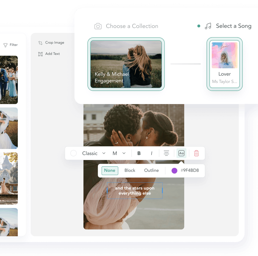
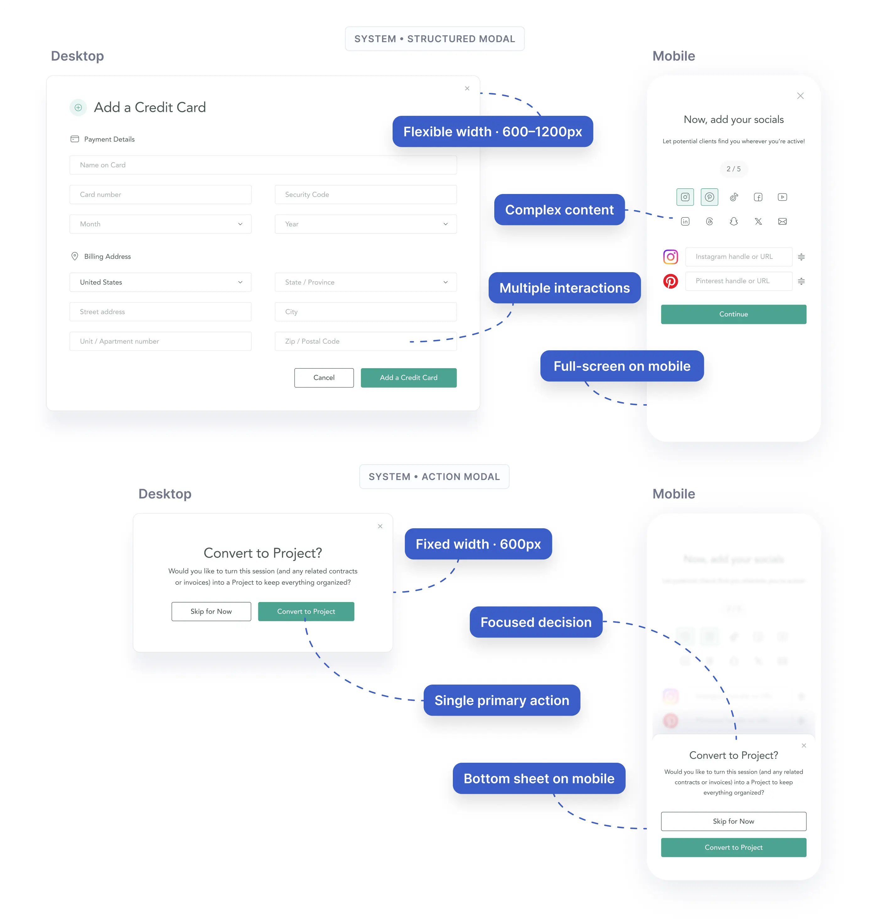
Dialogs were the clearest example. Existing implementations varied in structure, sizing, action placement, and responsive behavior, so I reviewed dozens of real examples before consolidating them into a smaller set of reusable patterns.
The result was two core modal families: a structured modal for more complex content and an action modal for focused decisions, each with defined desktop and mobile behavior. Engineering then implemented the corresponding patterns in Storybook and code. That principle carried across the system: cover common cases well, support legitimate variation intentionally, and avoid adding complexity for edge cases that had not earned a place in the shared component.
Why it mattered: Standardization only created value if the system could support the real range of product needs without recreating the complexity it was meant to remove.
.webp)
.jpg)
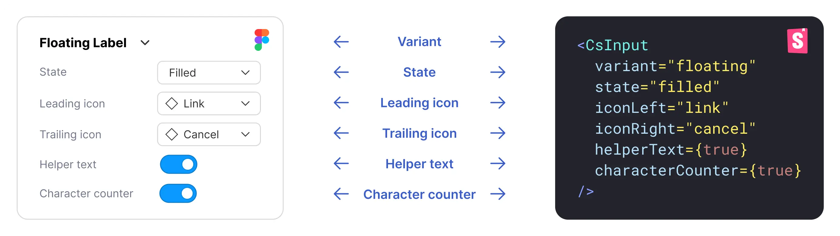
A design system only worked if the component logic was consistent on both sides of the handoff. I partnered closely with engineering to make Figma and Storybook reflect the same states, variants, naming, and behaviors instead of treating design and code as separate sources of truth.
That collaboration changed the components themselves. For example, engineering recommended supporting a second text-field pattern where the label persists above the field instead of forcing every input into one treatment. We also adjusted icon and typography naming to better match the existing codebase.
The goal wasn't perfect one-to-one parity everywhere. It was to establish a shared contract clear enough that developers could map designs to known production components without reconstructing the intended behavior.
Why it mattered: The system could only reduce interpretation if designers and developers were working from the same underlying component logic.
.jpg)
As the system matured, I realized that polished variants and states were not enough. The team also needed to know which behaviors were fixed, which variations were supported, and where flexibility was intentional.
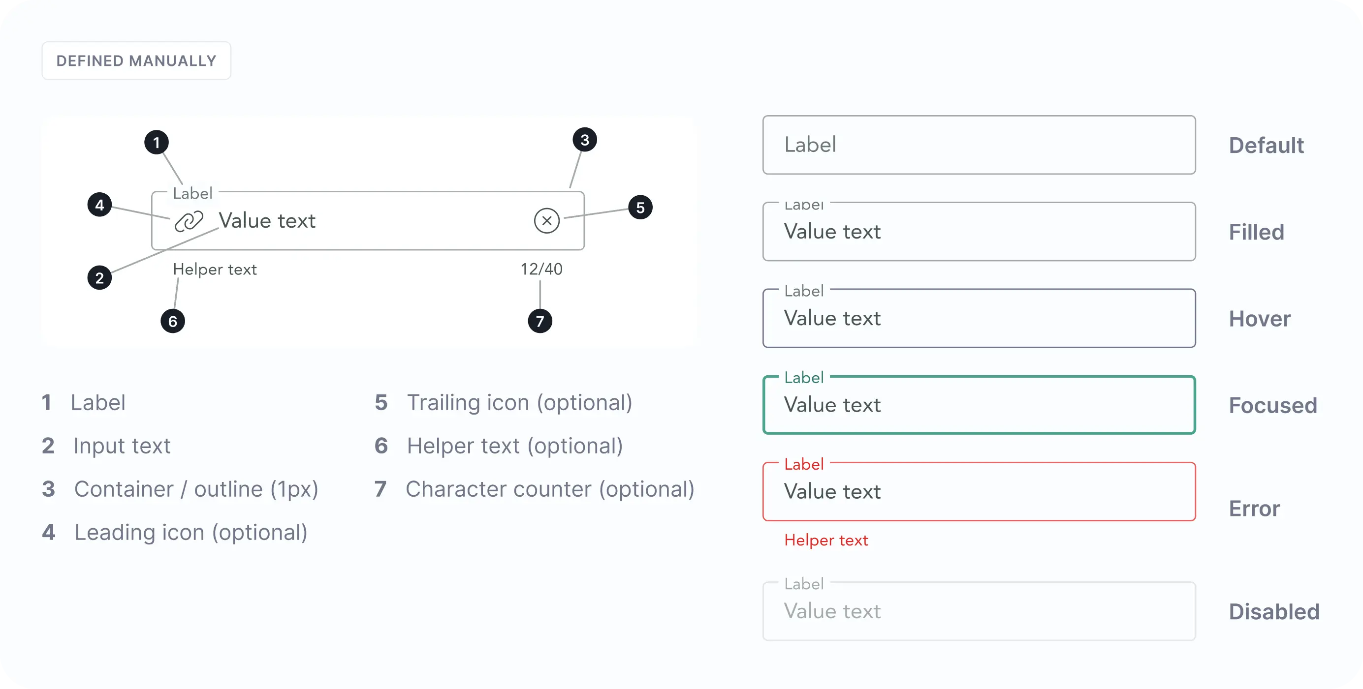
I started treating that behavioral logic as part of the component itself. Buttons, text fields, dialogs, and other controls were defined with complete states, supported configurations, and clearer boundaries around what should remain consistent versus what could adapt to the product context.
Accessibility became part of those rules rather than a check at the end of a feature. I standardized considerations like color contrast, visible focus states, interaction states, and minimum target sizes within shared patterns so those requirements didn't have to be rediscovered project by project.
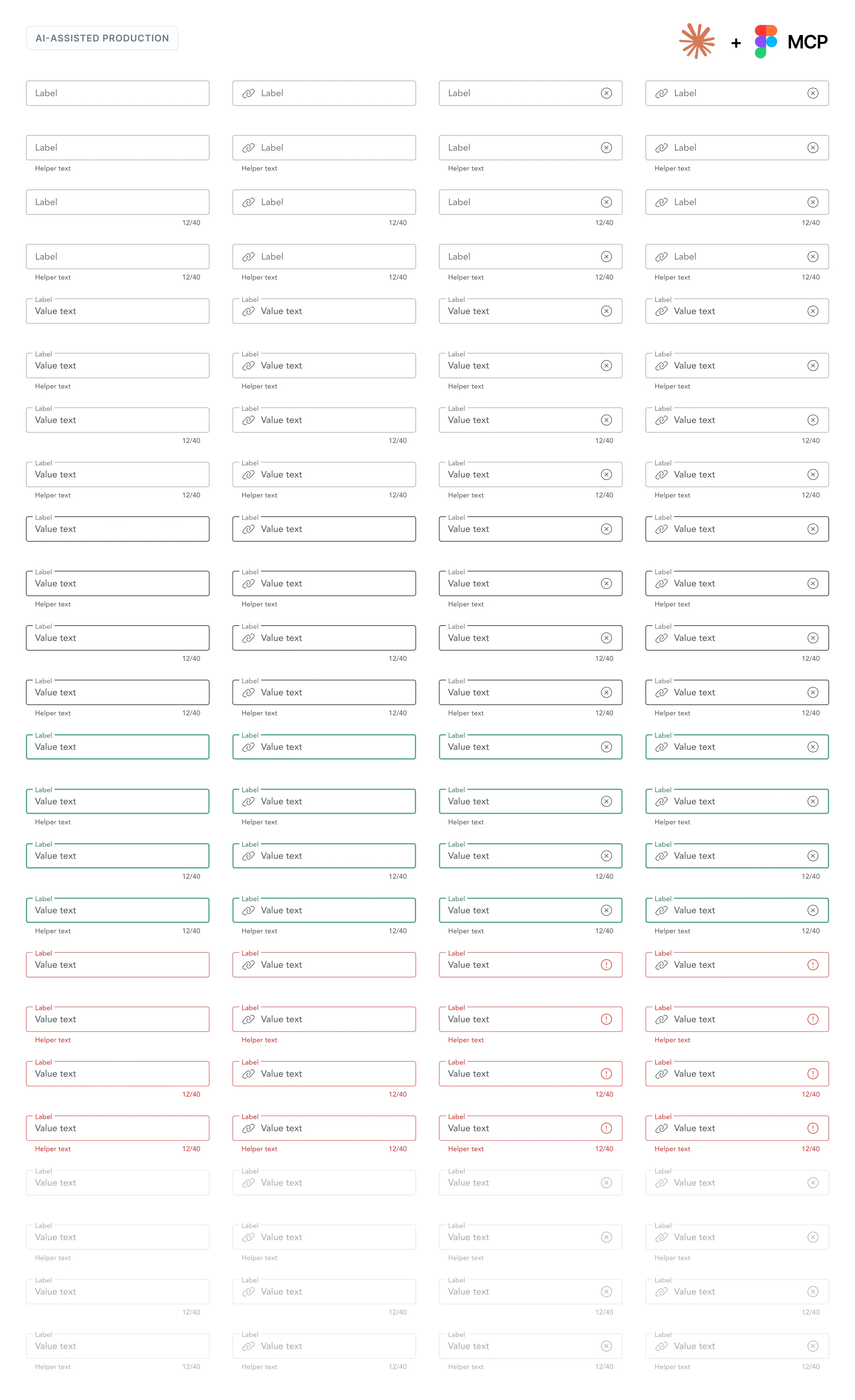
For high-variant components like buttons and text fields, I also used Claude to accelerate production. I defined the base component, states, variable logic, and supported options, then used Claude's Figma capabilities to generate the broader component structure and combinations. That shifted my time away from repetitive assembly and toward reviewing edge cases, QAing behavior, and aligning the system with engineering.
Why it mattered: A reusable component isn't just a visual asset. It encodes decisions about behavior, accessibility, and appropriate use so the team doesn't have to make them again.
.jpg)
A focused foundation for everyday product work
Rather than trying to maximize component count, I focused the system on the foundations and patterns that appear repeatedly across CloudSpot.
.png)
.png)
.png)
.png)
120+ icons implemented in Storybook, with standardized sizing, color, and stroke-weight options.
The goal was not completeness for its own sake. It was to establish a reliable set of shared patterns that could cover the majority of everyday product work and expand as real needs surfaced.
Shared patterns were beginning to compound across new and legacy work.
The clearest signal was adoption beyond the core design-system work. In a sprint retrospective, an engineer who had not helped build the system described his first project using it as “a very smooth process” because he could follow the documentation and Storybook components.
The system also started creating measurable leverage. During a legacy UI migration, a developer estimated that the shared components saved about half a day of work. In another project, an initial page block took roughly a week to implement; once the underlying patterns were established, seven subsequent blocks were built in roughly two days.
These were early signals, but they showed the system moving beyond visual consistency toward a foundation the team could use to build and migrate product work more efficiently.
A design system succeeds through adoption, not component count.
The biggest lesson was that publication wasn't the finish line. Real product work exposed gaps that polished component files could not, from unclear usage rules and missing variants to naming mismatches between design and code.
That changed how I thought about the system. The work wasn't simply maintaining a library. It was maintaining a shared product language. Each implementation became another test of whether that language was clear enough to use without unnecessary interpretation.
There is still more to standardize, but the foundation is now strong enough that new work can increasingly begin with established patterns, while real usage continues to inform what the system needs next.