Clinical Pathways Mobile App

Improving access to clinical guidance by transforming static protocols into usable, real-time decision tools

Role
UX Research & Product Design
Organization
AMPATH Ghana & NYU
Timeline
Summer 2024
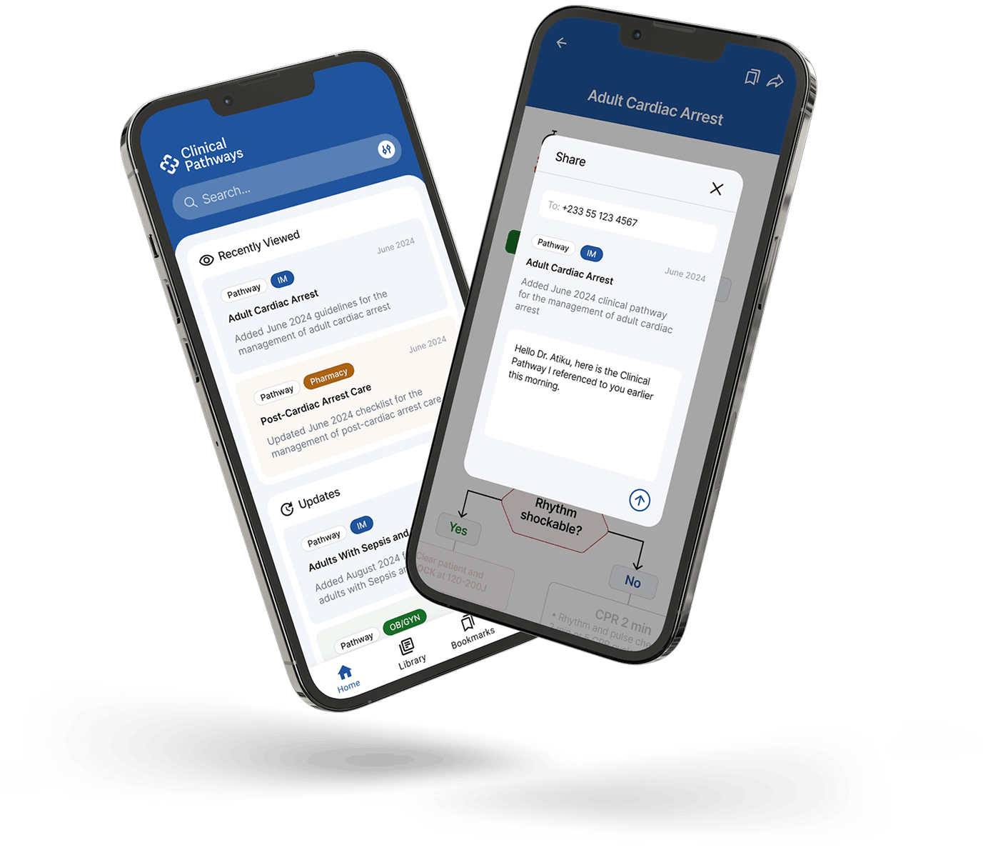
Two smartphones displaying a clinical pathways app; the left phone shows a search bar and lists recent and updated clinical pathways related to adult cardiac arrest, post-cardiac arrest care, sepsis, and obstetrics/gynecology. The right phone shows a share screen for the Adult Cardiac Arrest pathway with a message to Dr. Atiku referencing the clinical pathway.
0
1
Mobile app
Global health

‍Solo Product Design Lead: Led research through high-fidelity prototyping, defining the app structure, core flows, UI direction, and early component patterns.

Team: Partnered with an NYU medical team embedded at Tamale Teaching Hospital, local care providers, and AMPATH Ghana leadership.

Goal: Translate locally adapted clinical pathways from posters and PDFs into a mobile product that could expand access to real-time clinical guidance across northern Ghana.

Current state: Designs supported grant proposals and later helped guide a functional version now being used by clinicians across multiple hospitals.

Why This Mattered

In northern Ghana, “resource-limited” was not a general constraint. It shaped every clinical decision this product needed to support.

Clinicians at smaller hospitals and rural clinics often make treatment decisions without access to reliable diagnostics, consistent medication supplies, or senior support nearby. International guidelines often assume access to equipment, drugs, and tests that simply aren’t available. In that context, a guideline that says “order an MRI” or “administer Drug X” may be technically correct, but practically unusable.

At Tamale Teaching Hospital — the largest training hub in the region — AMPATH Ghana and local clinicians had already developed a better model: locally adapted clinical pathways designed around the resources actually available. Distributed as posters and PDFs, the pathways were already helping clinicians make more consistent decisions. The model worked. The problem was reach.

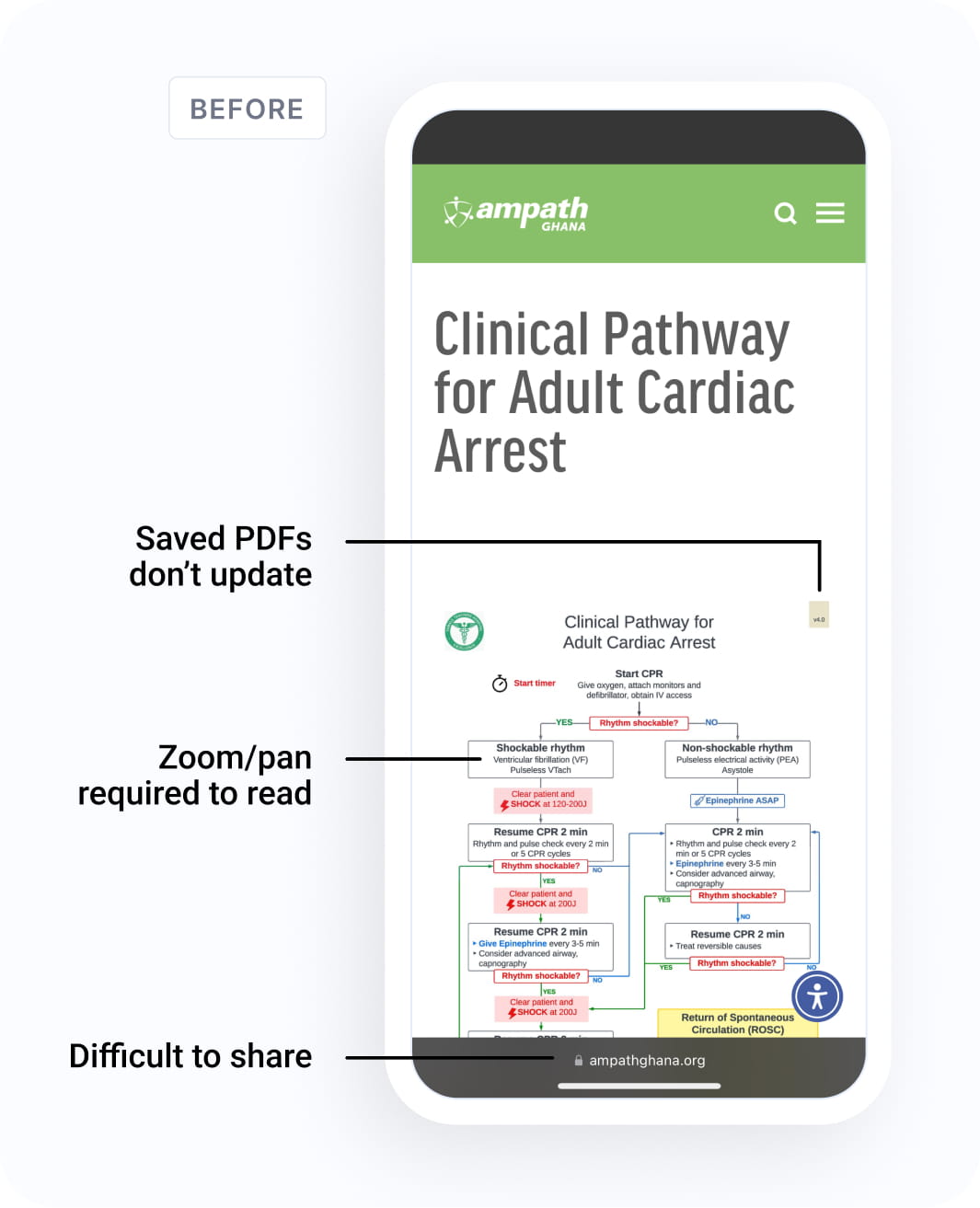
Posters were fixed to hospital walls. PDFs were hard to use on phones. Updates were slow and costly. Fewer than 6% of care providers were accessing the website’s PDF library, which meant the clinicians at smaller clinics, who needed guidance most, often had the no access to it.

A competitive audit confirmed the gap: existing clinical pathway tools were either too expensive, too narrow, too broad, or still relied on static PDF-style content. None solved the actual problem: locally adapted, multi-specialty guidance designed for real-time use in resource-limited settings.
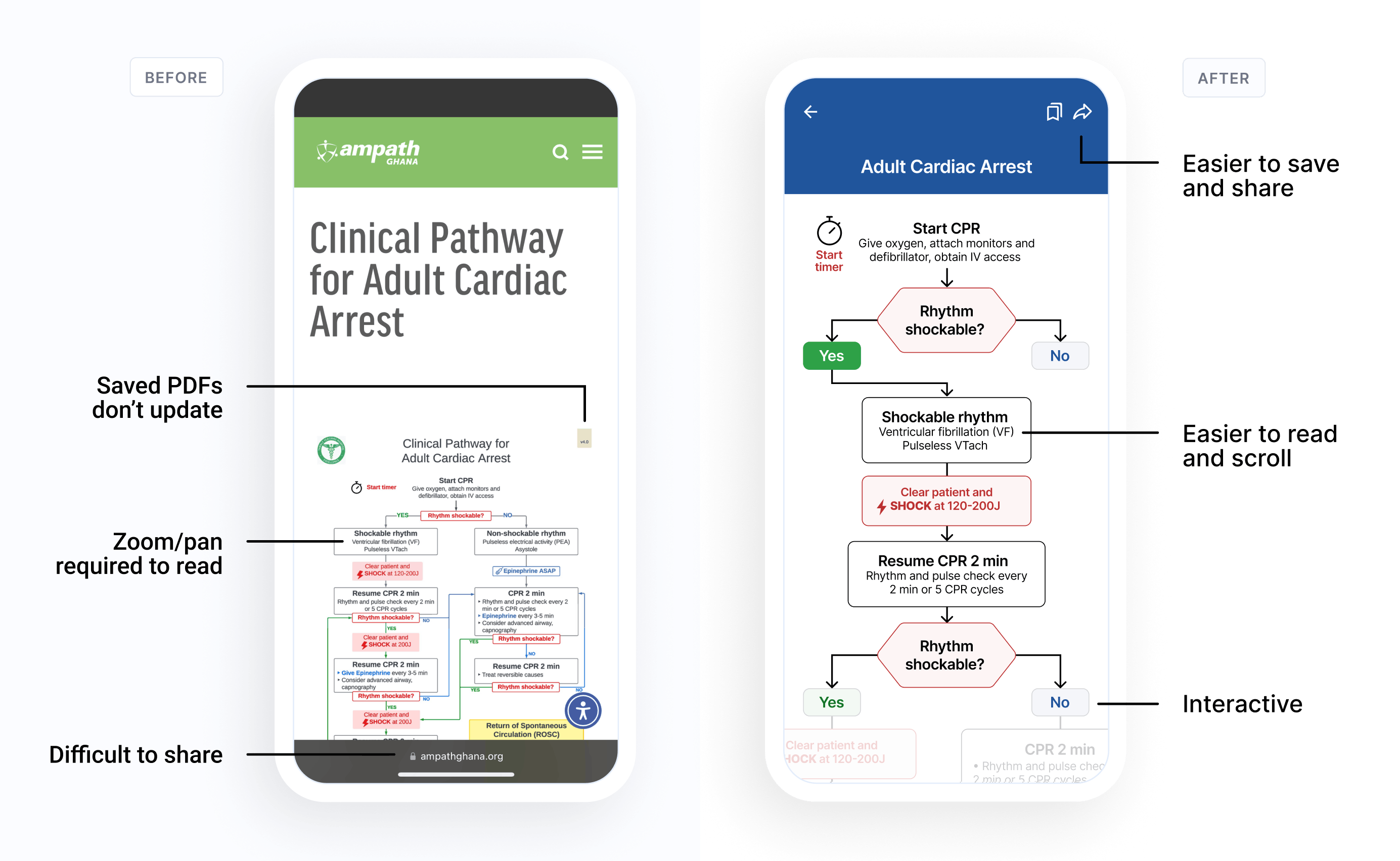
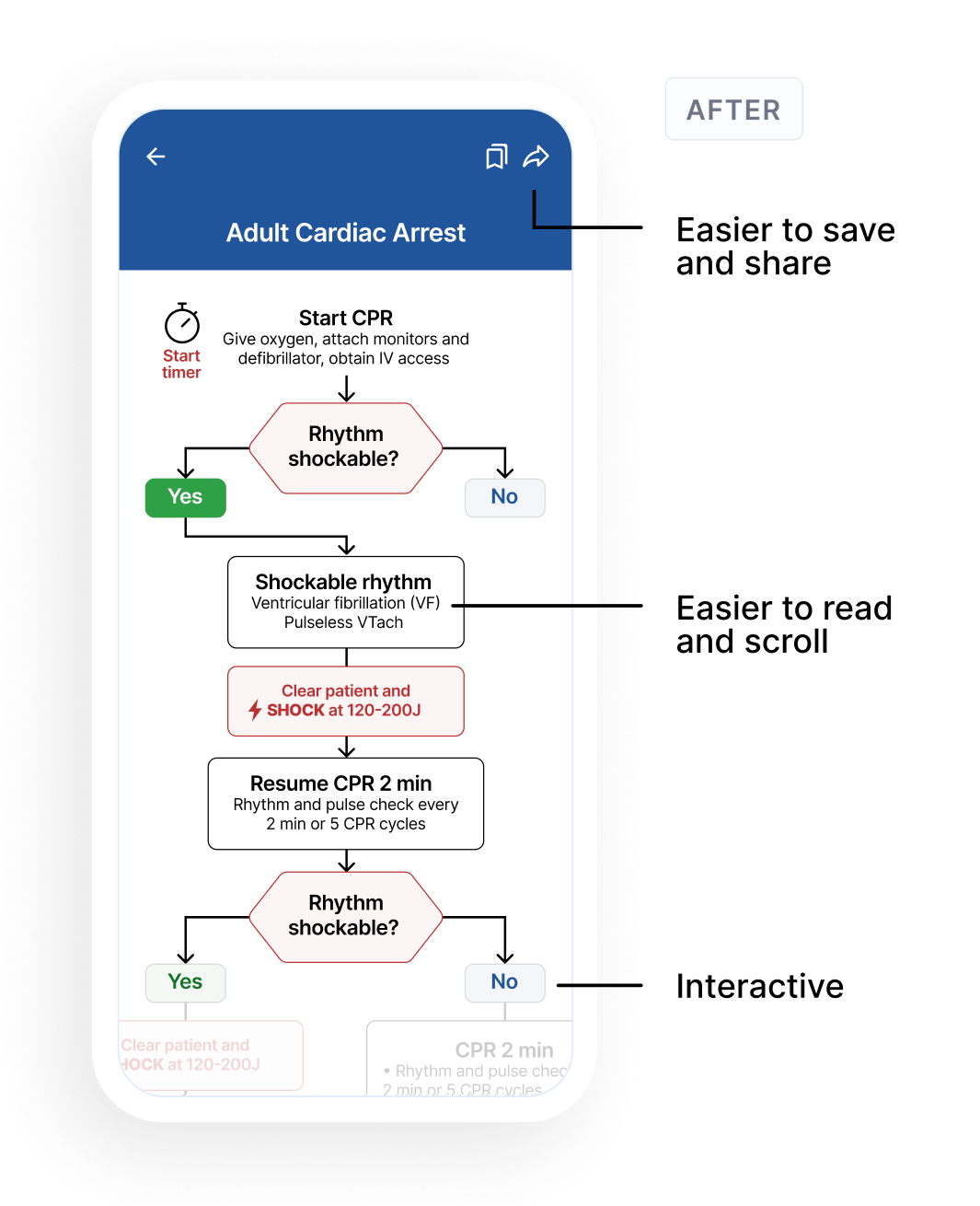
Comparison of two mobile screens showing a clinical pathway for adult cardiac arrest. The left screen labeled 'Before' displays a PDF of the pathway that is difficult to read without zooming and is hard to share, with annotations pointing out 'Saved PDFs don’t update,' 'Zoom/pan required to read,' and 'Difficult to share.' The right screen labeled 'After' shows a clear, interactive flowchart with steps for CPR, rhythm shockability assessment, and actions like administering shocks or epinephrine, designed for ease of use and sharing.
Mobile screen showing a PDF document titled 'Clinical Pathway for Adult Cardiac Arrest' from ampath Ghana with annotations pointing out that saved PDFs don't update, zoom and pan are required to read, and the content is difficult to share.Mobile screen showing an adult cardiac arrest clinical pathway starting with CPR, assessing if rhythm is shockable. If yes, identify shockable rhythm (ventricular fibrillation or pulseless ventricular tachycardia), clear patient, and shock at 120-200J, then resume CPR for 2 minutes with rhythm and pulse checks every 2 minutes or 5 cycles. Reassess shockable rhythm; if yes, repeat shock; if no, continue CPR and monitoring. Flowchart style with decision nodes, arrows, and instructions.

The User problem

The pathways were working, but the access model was not.

The primary user was a clinician managing high patient loads with variable resources, unreliable internet, and limited specialist support nearby.

I focused on three provider types: House Officers, Medical Officers, and Specialists. Their experience levels varied, but the shared need was consistent: fast access to trusted, locally relevant guidance during patient care.

The problem was not whether the pathways were valuable. Survey data from 37 clinicians showed the existing program was already improving consistency, outcomes, and medical education. The issue was access: posters were fixed in place, PDFs were difficult to use on mobile, and fewer than 6% of providers were regularly accessing the digital library.

That translated into three product requirements:

USER REALITY

Clinicians needed guidance during active patient care, not after the fact

PRODUCT REQUIREMENT

Make pathways usable at the point of care

USER REALITY

Available medications, diagnostics, and equipment varied by facility

PRODUCT REQUIREMENT

Support locally validated guidance, not generic international protocols

USER REALITY

Pathways included checklists, branching decisions, and reference tables

PRODUCT REQUIREMENT

Create one flexible display system for multiple pathway structures

CONSTRAINTS

The product had to work where typical clinical tools assume too much.

The product requirements became three design principles. Each one was specific to this environment.

Offline-first, not offline-capable
The app had to be useful without assuming a reliable connection. Offline access was not a fallback state. It shaped the product foundation.
Speed and scannability over comprehensiveness
Clinicians did not need another long document to read during care. The product needed to surface the next useful step quickly.
Flexible structure, consistent experience
The pathways varied widely: linear checklists, branching decision trees, and reference tables. The display system had to support that variety without making the product feel fragmented.

Key Decisions

The biggest design decisions were product decisions, not screen-level choices. Each one came from the same constraint: the app needed to be reliable, fast, and scalable in environments where internet access, resources, and clinical workflows varied widely.

Decision 1

Offline-first as a product foundation, not a feature

Reliable access was the core product requirement. In this context, offline access could not be treated as a fallback state or secondary mode.

I designed the product around an offline-first model: first access required connectivity, but once opened, pathways remained available later without a connection. Updates synced quietly when internet access returned.

Open once online
1
Cache to device
2
Use offline later
3
Sync when connected
4
Open once online
1
Cache to device
2
Use offline later
3
Sync when connected
4

What I left out: Heavy media, real-time-only features, personalization that required live data, and search across uncached content.

Why it mattered: Every feature had to pass the same test: does this still work when there’s no signal?

Decision 2

A flexible display system for structurally diverse pathways

The pathways were not all the same shape. Some were linear checklists, some were branching decision trees, and others were dosing tables or references.

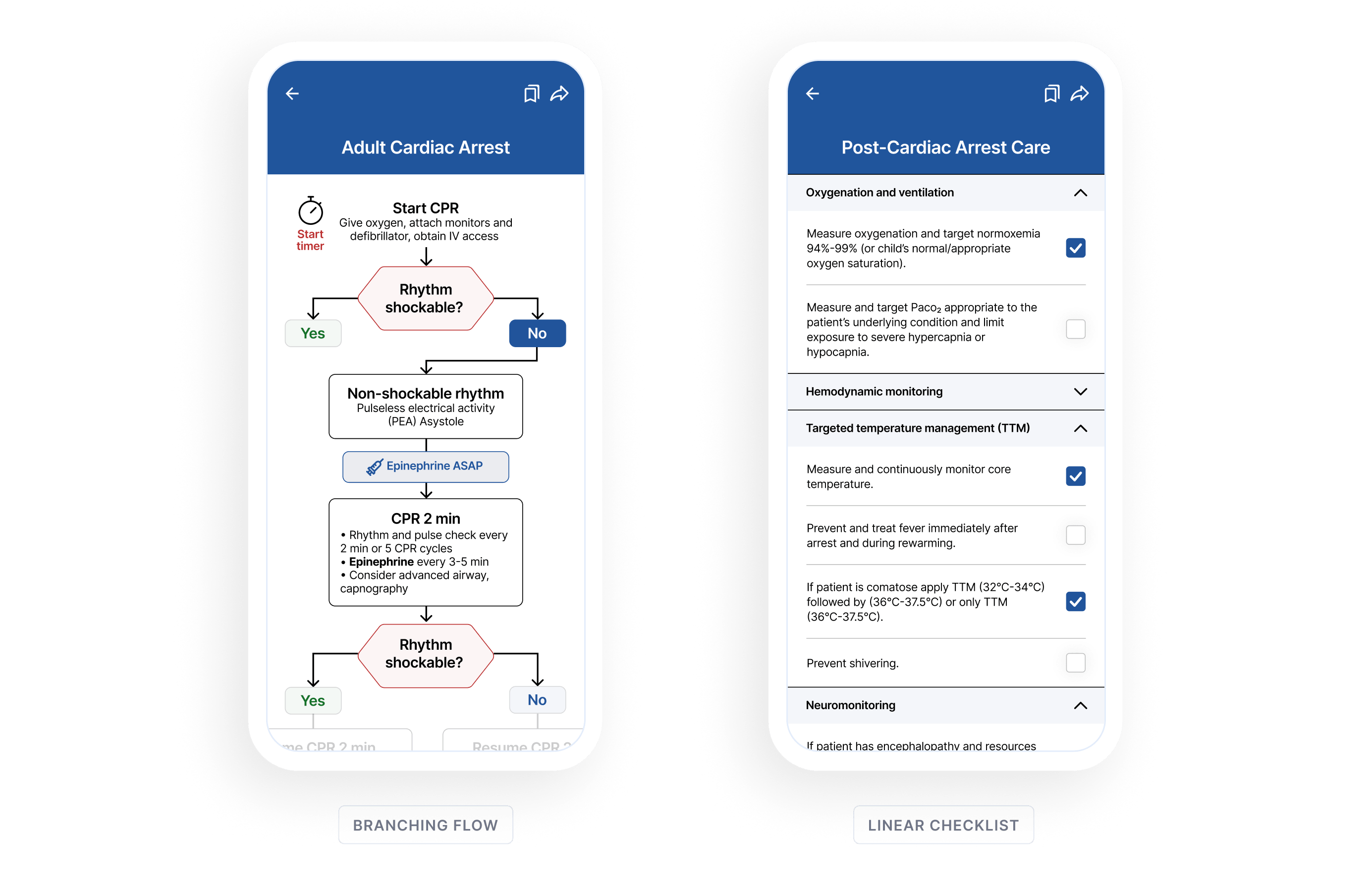
Designing a custom mobile layout for each pathway would not scale. Forcing every pathway into one rigid template would distort the clinical logic. I designed a flexible, mobile-first display system built around shared components and a consistent interaction model, so different pathway types could feel like one product without requiring custom design work for every guideline.

What I left out: Free-form authoring, rich media inside pathways, and multi-column layouts that would not hold up on small screens.

Why it mattered: Without a flexible system, every new guideline became a design project. With it, the product could scale from a small set of launch pathways to a much larger clinical library.

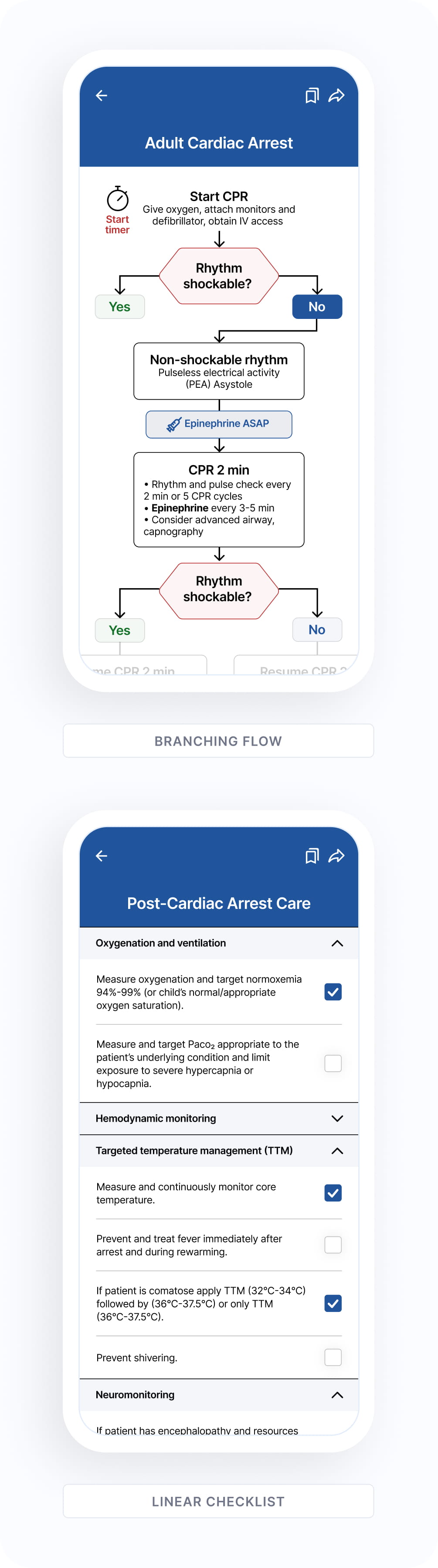
Two smartphone screens showing clinical decision tools: the left screen displays a branching flowchart for Adult Cardiac Arrest guiding CPR steps based on rhythm shockability; the right screen shows a linear checklist for Post-Cardiac Arrest Care with expandable sections for Oxygenation and ventilation, Hemodynamic monitoring, Targeted temperature management, and Neuromonitoring with checkboxes for tasks.
Two screenshots of a medical mobile app showing clinical pathways for cardiac arrest. The top image is a branching flowchart for Adult Cardiac Arrest, starting CPR with oxygen and IV access, checking if rhythm is shockable, treating non-shockable rhythms with epinephrine and CPR, then reassessing rhythm shockability. The bottom image shows a linear checklist for Post-Cardiac Arrest Care with expandable sections for Oxygenation and ventilation, Hemodynamic monitoring, Targeted temperature management with checkboxes for tasks like monitoring core temperature, preventing fever, and applying TTM protocols.
Shared navigation, step patterns, callouts, and warning states kept different pathway structures feeling like one product.
Decision 3

Peer sharing as the distribution strategy

The hardest problem was not whether clinicians would understand the app. It was whether the product could reach clinicians beyond Tamale Teaching Hospital.

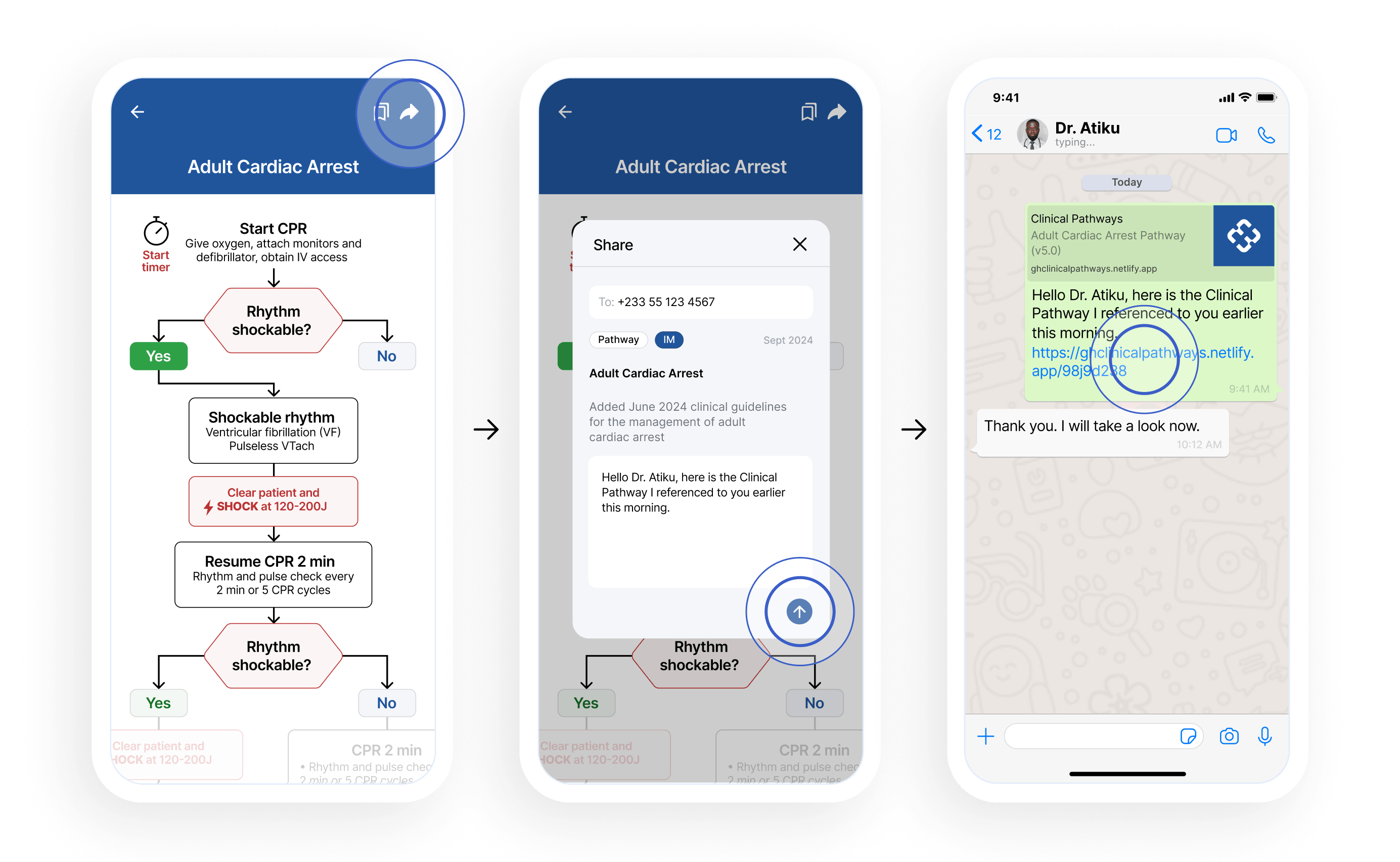
Clinical knowledge often travels through trust networks: one provider sharing a useful resource with another. I designed sharing as a core pathway action, not a settings utility. A clinician could share a pathway through WhatsApp with a pre-filled message, preserving the human context around the recommendation.

Two product decisions supported that model: the app was web-based, so a shared link could open immediately with no app-store download, and account creation was progressive. Clinicians could view a pathway first, then create an account when they wanted to save, bookmark, or share.

What I left out: Social features, algorithmic recommendations, and upfront account creation.

Why it mattered: For this product, distribution was part of the user experience. A pathway shared by a trusted colleague carried more credibility than a generic link or institutional announcement.

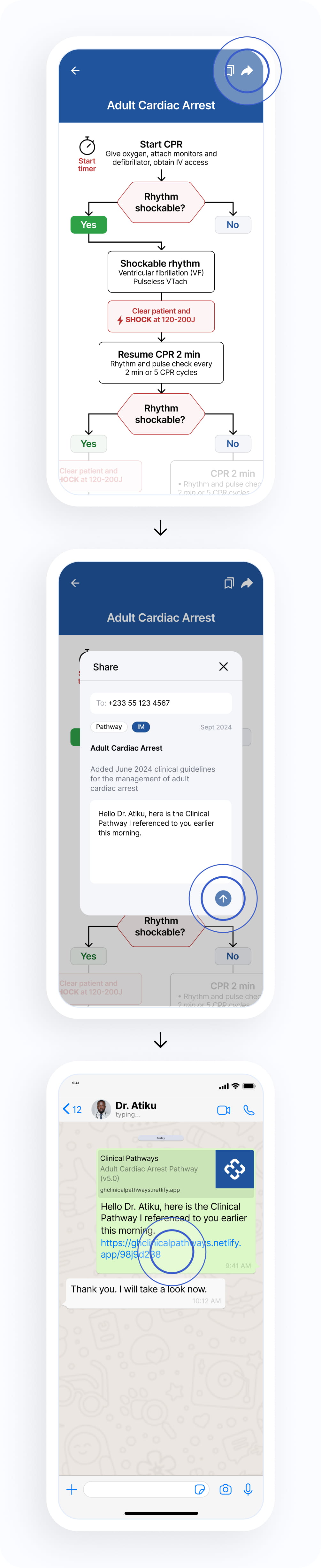
Three smartphone screens showing the process of sharing an Adult Cardiac Arrest clinical pathway. The first screen displays a flowchart for adult cardiac arrest management with options for shockable rhythm and CPR steps. The second screen shows a share dialog with a message to Dr. Atiku referencing the clinical pathway link. The third screen displays a WhatsApp chat with Dr. Atiku, containing the shared link and a thank-you reply.
Three smartphone screens illustrating the sharing of an Adult Cardiac Arrest clinical pathway: The first screen shows a flowchart for cardiac arrest management with CPR steps, rhythm check, and shock instructions; the second screen shows a sharing interface with a message to Dr. Atiku including the pathway details and a text note; the third screen shows a chat conversation where Dr. Atiku acknowledges receiving the clinical pathway link.
A pathway could move from one clinician to another without requiring an app-store download or upfront account creation.

Solution

The final design turned a PDF library into a usable point-of-care tool.

Mobile app screen titled Clinical Pathways showing a search bar, recently viewed clinical pathways including Adult Cardiac Arrest with June 2024 guidelines, Post-Cardiac Arrest Care with updated checklist, and updates section listing Adults With Sepsis and Septic Shock and OB/GYN pathway, each with category tags, dates, and brief descriptions. Navigation bar at bottom includes icons labeled Home, Library, Bookmarks, and Account.

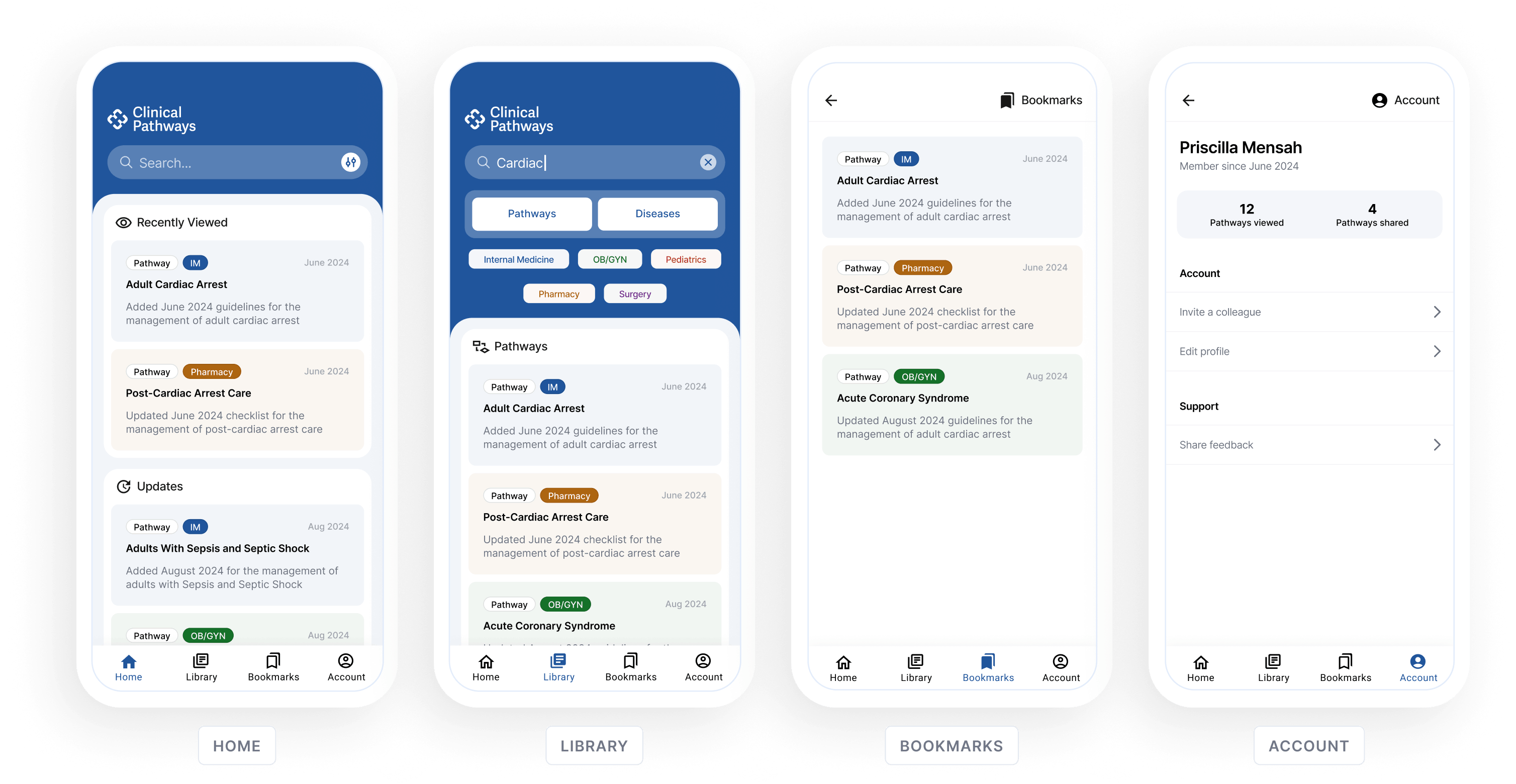
The validated design covered the core clinician experience: finding a pathway, using it during care, returning to frequently used guidance, and sharing it with a colleague.

The prototype flow showed how a clinician could move from search to actionable guidance without navigating a PDF library.

Four mobile screens showing a Clinical Pathways app interface: Home with recently viewed pathways like Adult Cardiac Arrest and Post-Cardiac Arrest Care; Library with search for 'Cardiac' and pathway categories; Bookmarks with saved pathways including Adult Cardiac Arrest and Acute Coronary Syndrome; Account page displaying user Priscilla Mensah's stats of 12 pathways viewed and 4 shared, plus options to invite colleague, edit profile, and share feedback.
Four vertically stacked screenshots of a Clinical Pathways mobile app showing different tabs: Home with recently viewed and updates on adult cardiac arrest and sepsis pathways; Library with a search bar, filter options including Pathways and Diseases, and a list of pathways like Adult Cardiac Arrest; Bookmarks tab listing saved pathways; Account tab displaying user information for Priscilla Mensah including member since date, pathways accessed, shared, account options, and support.

Outcome

The design helped move Pathways from proposal asset to working product.

The original design work produced a build-ready product direction and a set of grant proposal assets. The grant is still pending, but the design has already helped guide a functional version of the app, built in collaboration with a physician using Claude and Excel-based content tracking.

That scrappy live version is now giving us early evidence that the original product hypothesis was worth testing: locally adapted clinical guidance can reach farther when it is mobile, shareable, and easier to use at the point of care.

Early reach beyond Tamale

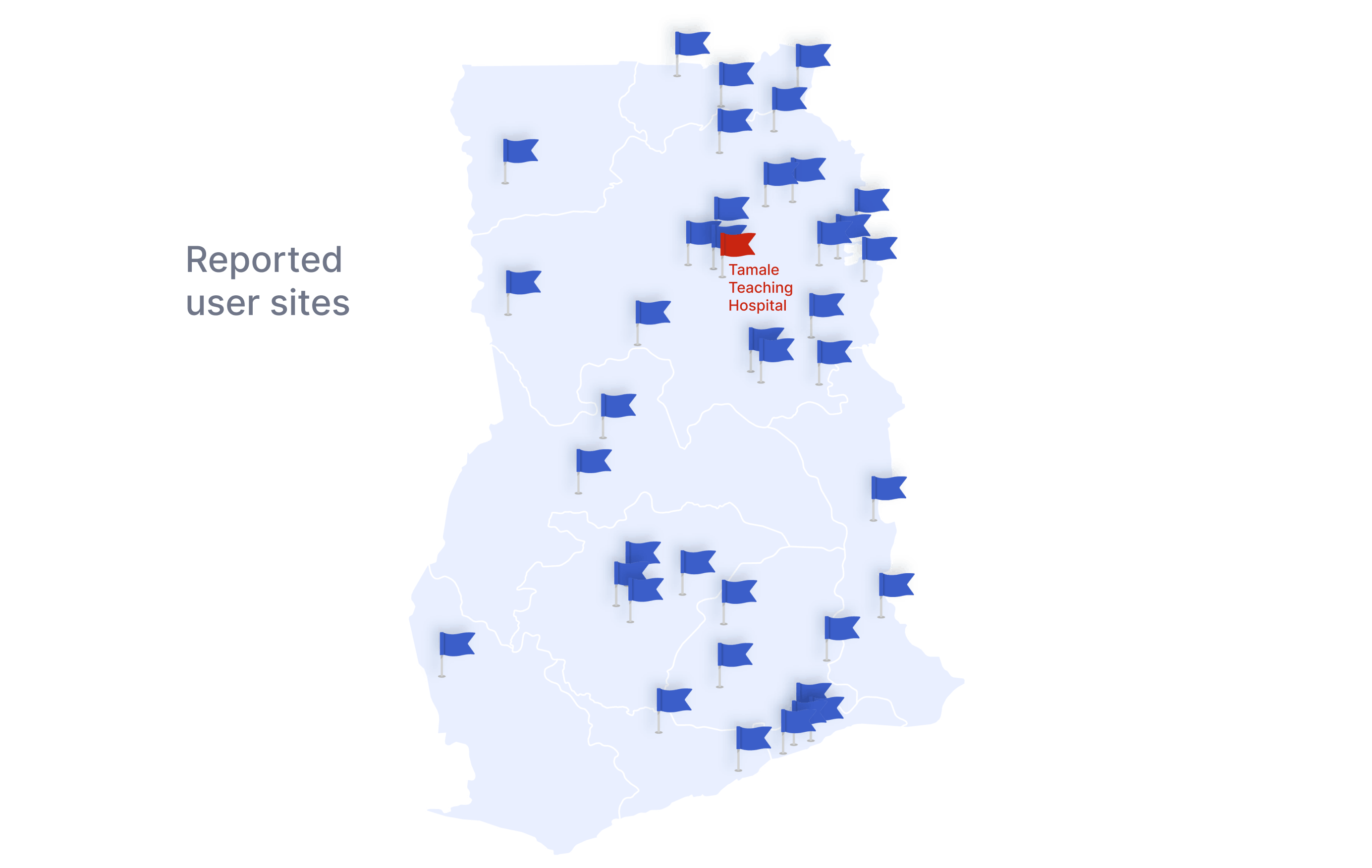
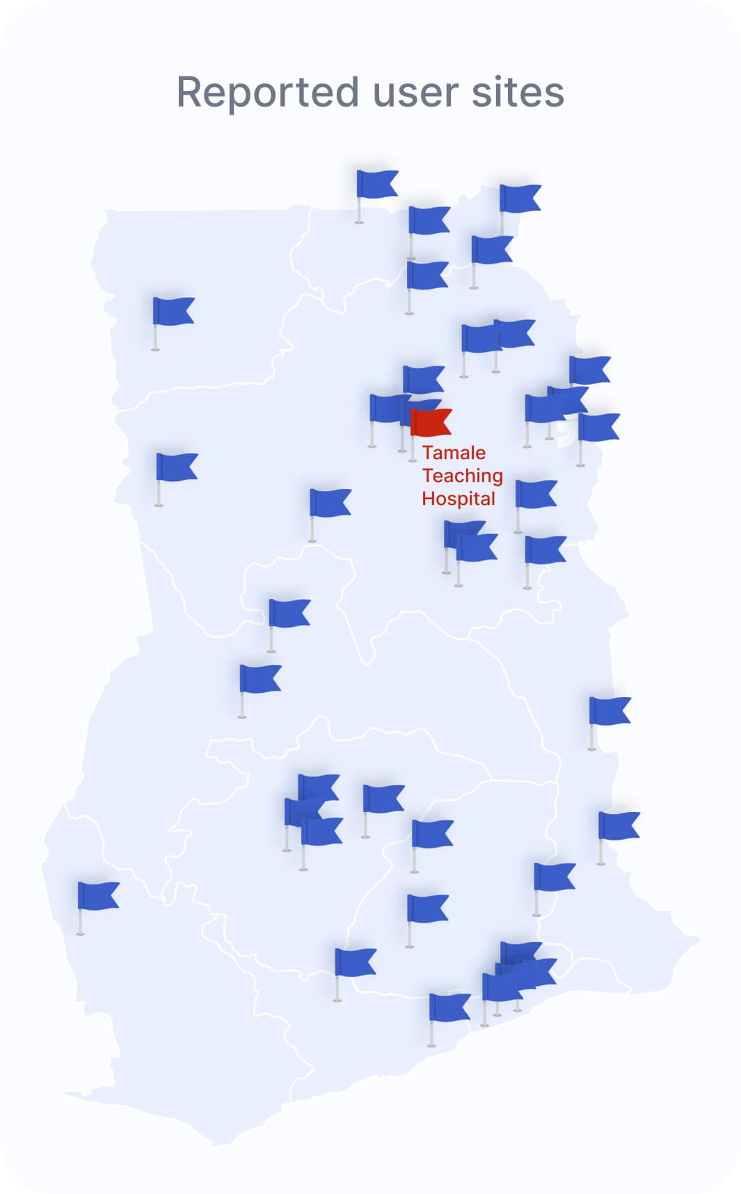
Registered users now span roughly 40 distinct hospitals, including teaching hospitals, district hospitals, and smaller rural facilities across northern Ghana. Tamale Teaching Hospital remains the largest single site, but the app is already reaching beyond the original flagship hospital.

Map of Ghana showing multiple blue flags indicating reported user sites distributed mainly in the northern, eastern, and southern regions, and one red flag labeled Tamale Teaching Hospital in the northern part.
Map of Ghana marked with multiple blue flags indicating reported user sites across the country, with a red flag highlighting Tamale Teaching Hospital in the northern region.
Approximate locations based on self-reported facility or location names from registered users.

Early usage signals

The most-opened pathways include high-acuity topics like Cardiac Arrest, Sepsis and Septic Shock, Tachycardia with a Pulse, DKA/HHS, and Hypertensive Emergency. This does not prove clinical impact yet, but it shows early use around the kinds of time-sensitive guidance the product was designed to support.

136
registered users
836
pathway opens
34
distinct pathways used
40+
hospitals represented

Growth has come in bursts, often tied to training, direct sharing, or word-of-mouth. That matches the product’s distribution strategy: clinical guidance spreads through trusted provider relationships, not passive discovery.

Get in touch

Have a role in mind or just want to talk shop? Feel free to reach out.